

Wight Tea
Brand Strategy
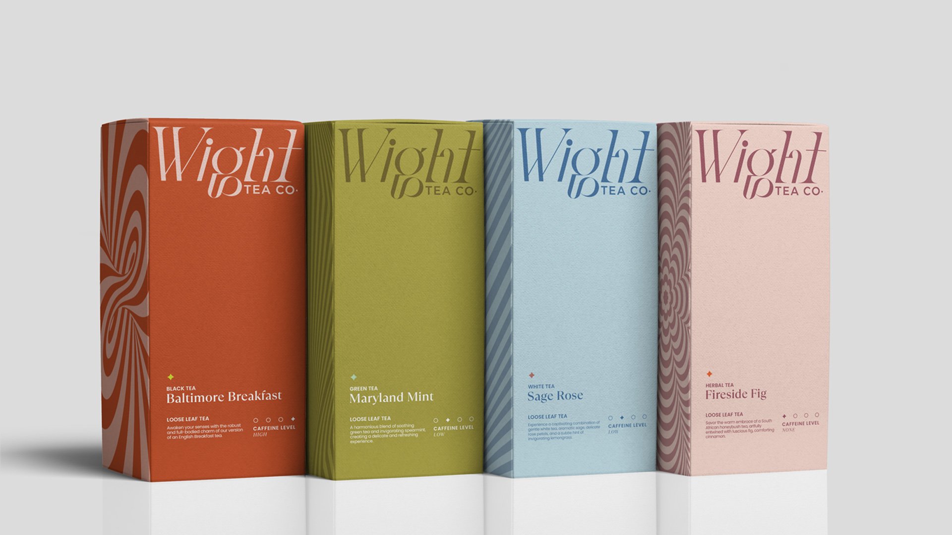
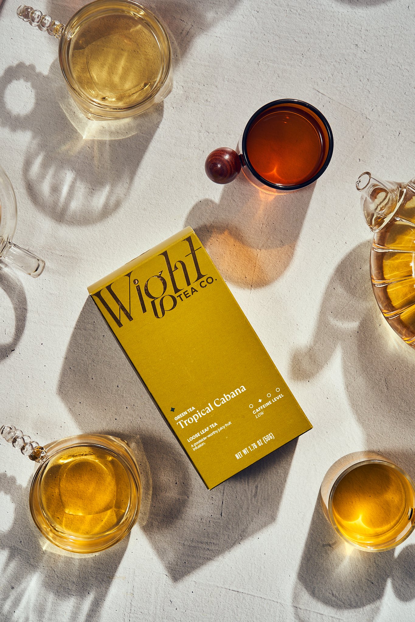
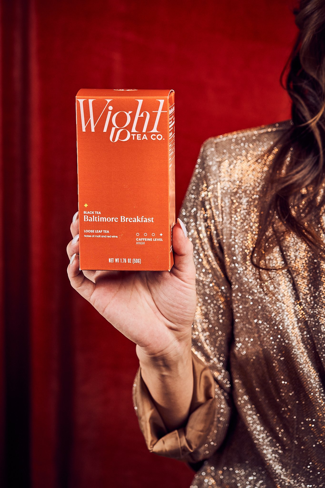
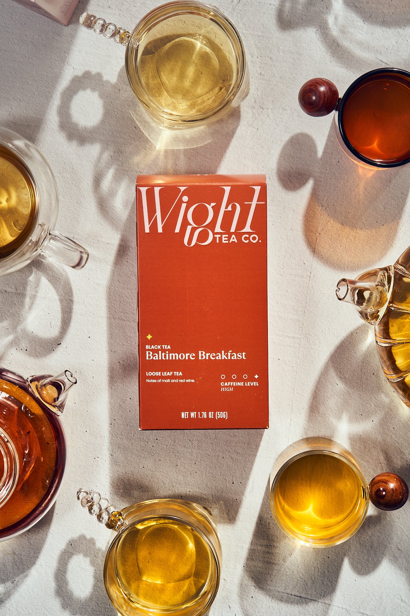
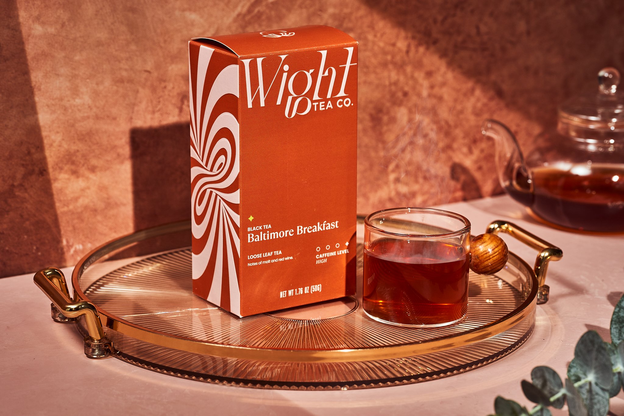
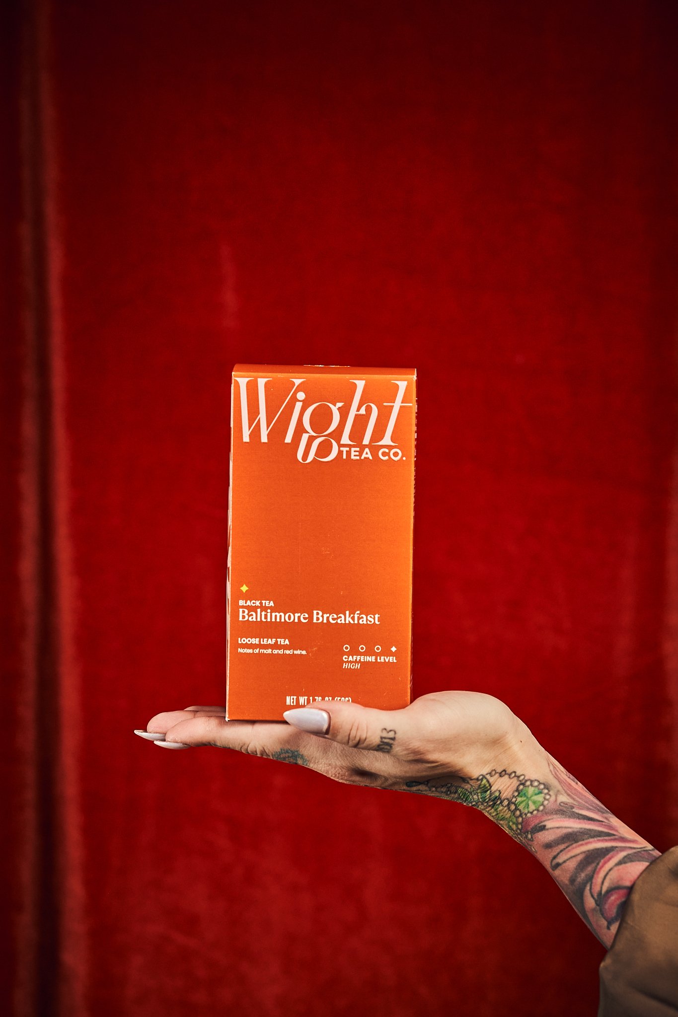
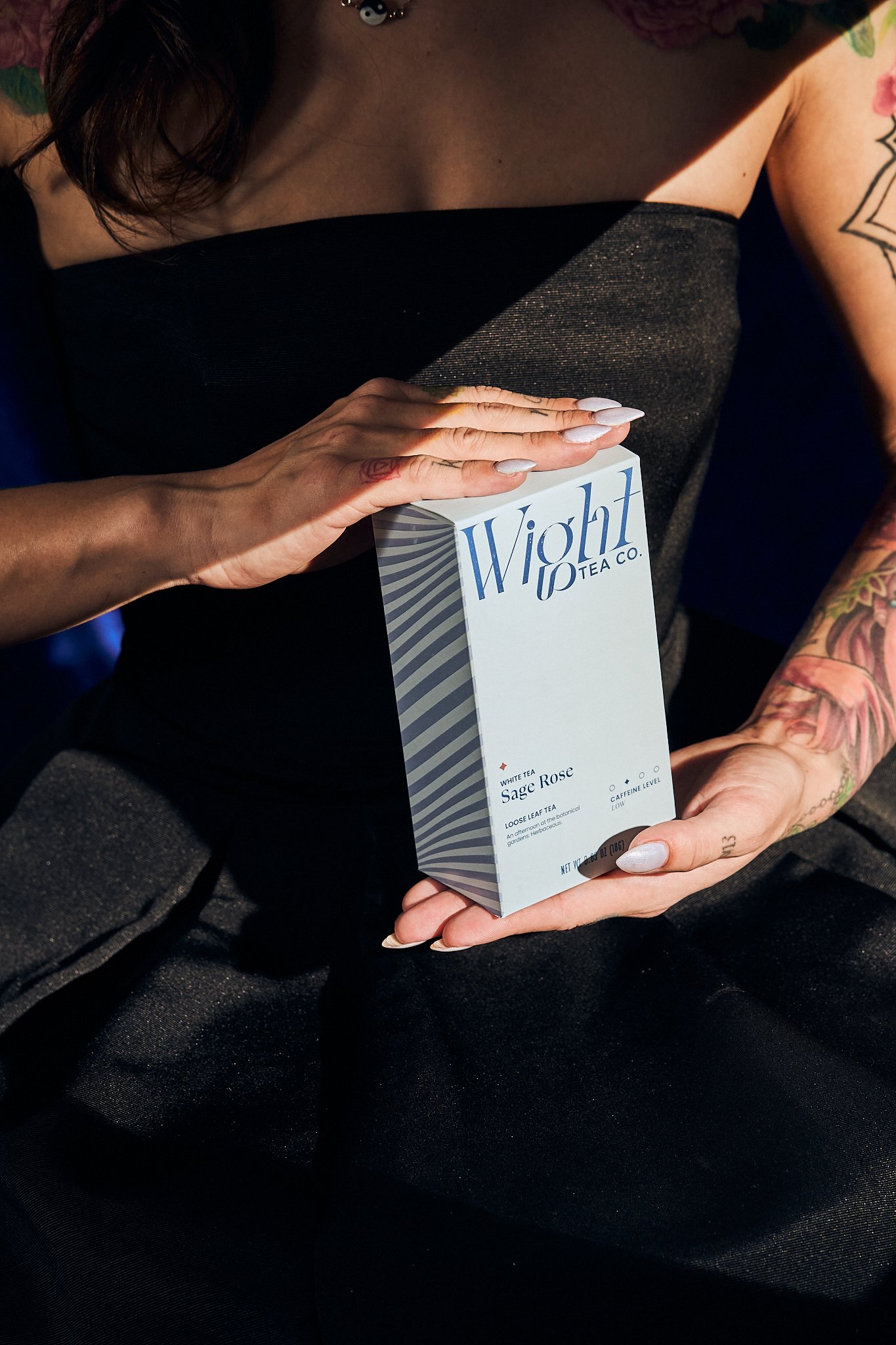
Brand Identity
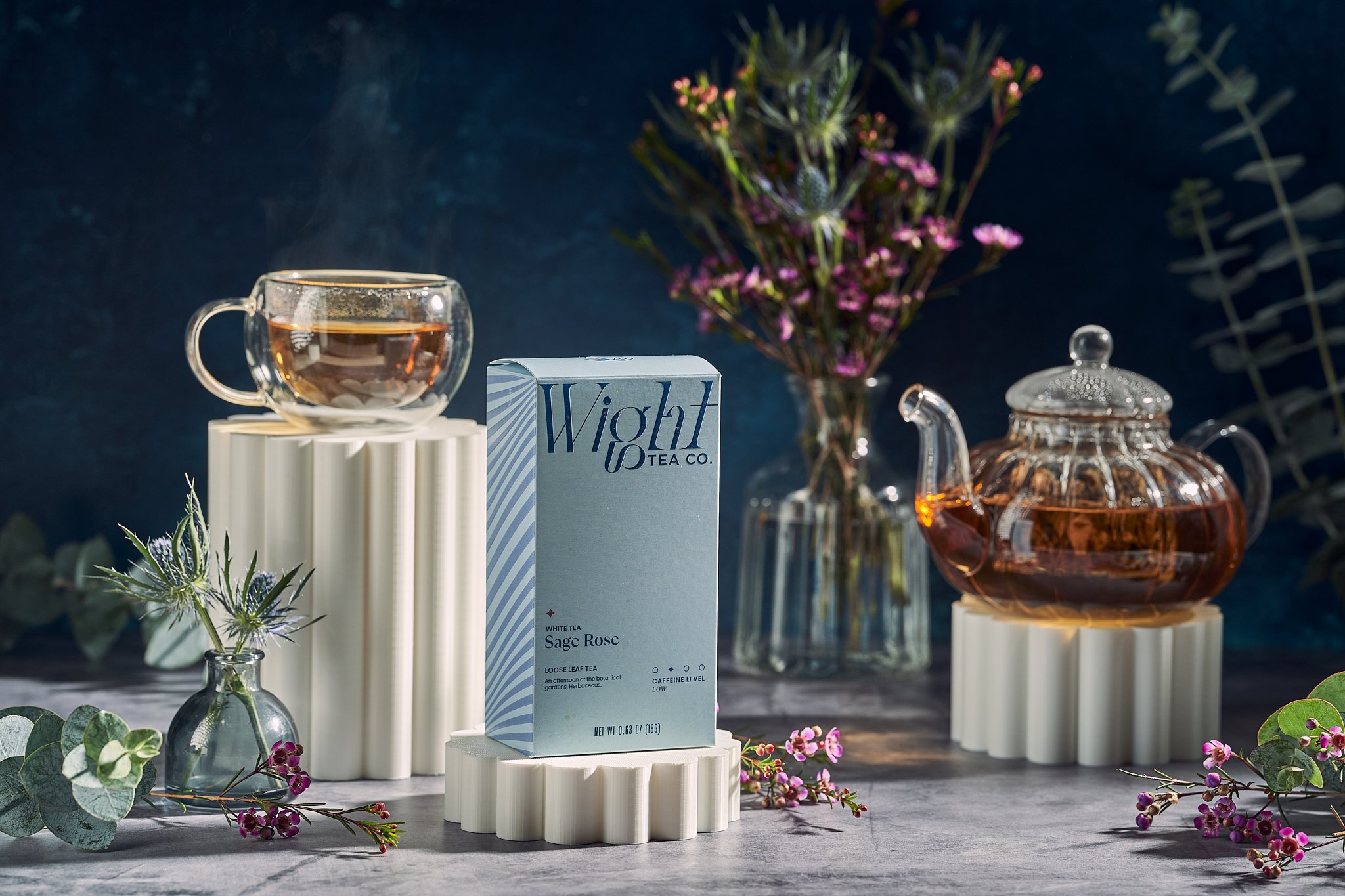
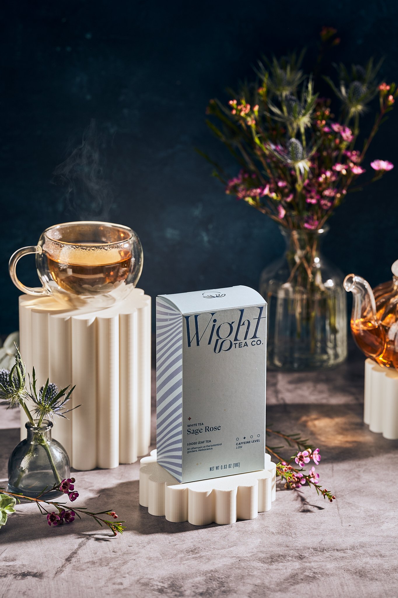
Package Design
Creative Direction
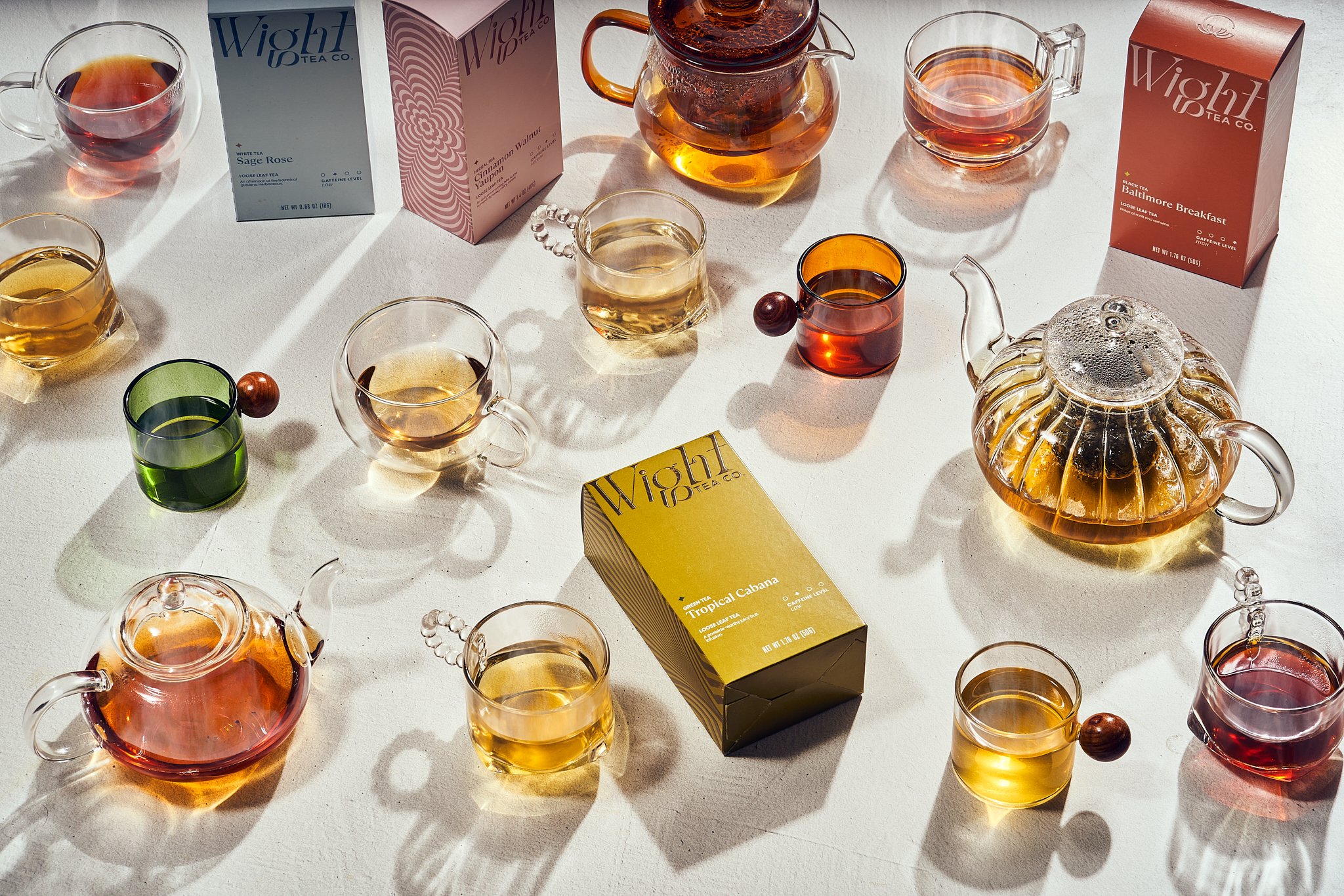
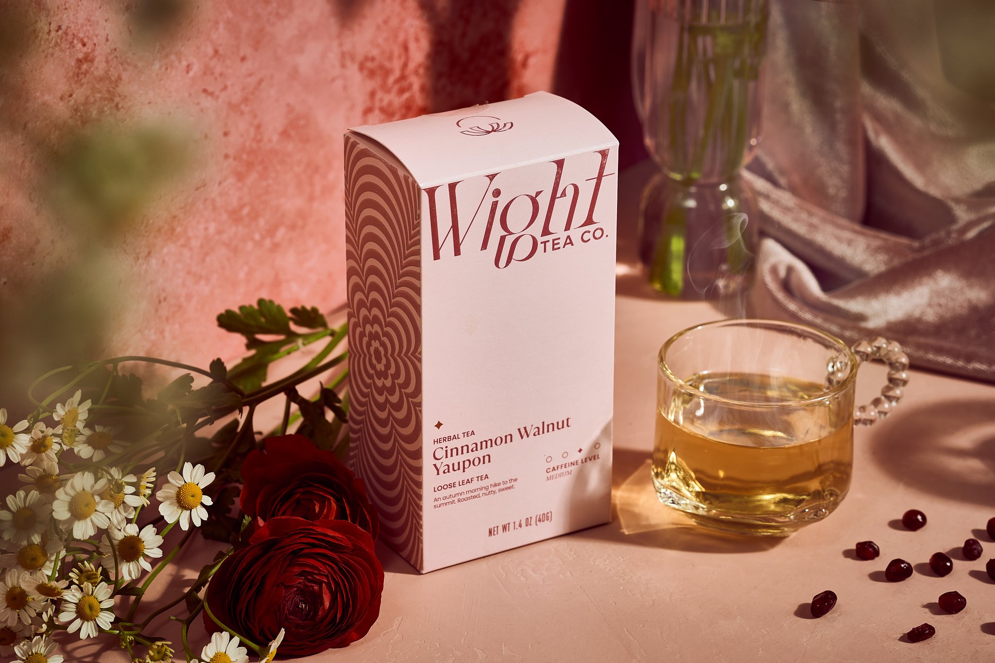
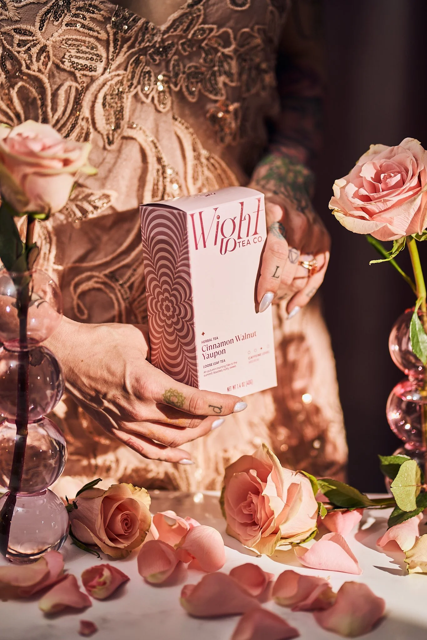
Styling and Props
Photography
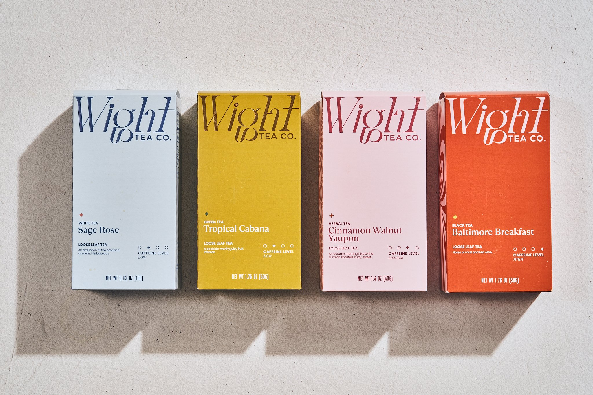
This premium loose-leaf tea needed to FEEL premium, and the initial logo made the brand feel a little bulky or even too playful for where this premium tea was headed.
We really wanted to highlight the idea of a flavor-forward experience. Wight Tea is not a wellness brand that mixes up herbal tea to help heal ailments. Wight Tea is about experience and flavor, and we wanted to indicate that through the bold colors and interesting, high-contrast logo type.
Another big aspect that sets this brand apart is endless possibility. What does it feel like to touch embossed tea packaging? What does it feel like to create an aspirational unboxing and shelf experience?
Differentiating Wight Tea from other tea brands in this aspect was going to be very important. Many tea brands lean into wellness and ritual. Wight Tea isn’t ritual, it’s possibility. Wight Tea is a mid-afternoon break, hiding away on a rainy afternoon to listen to a record, and booking a last-minute cabin for the weekend.


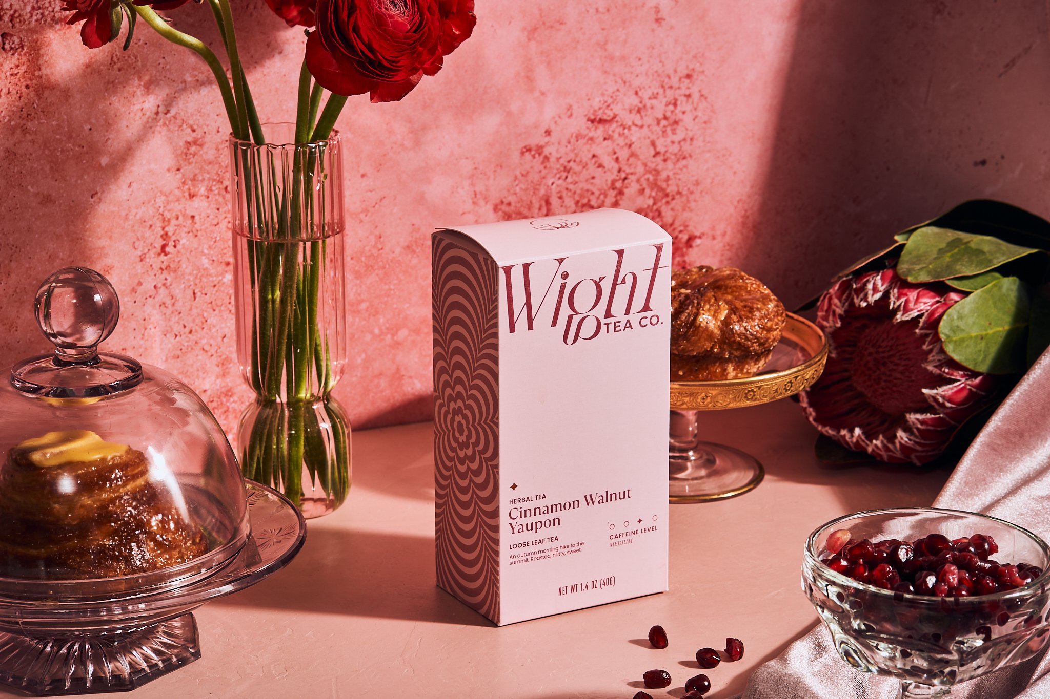
All it takes is a single sip of something vibrant to awaken your senses and remind you of the endless possibilities that exist in the world. So, perhaps it’s time to book that cabin in the woods, indulge in a cup of tea while you lose yourself in the pages of this month’s latest read, or even spontaneously invite your neighbor over at sunset to unwind a bit.
Let’s embark on a journey of discovery and savor the diversity of Wight Tea’s flavors. With countless options to choose from, the possibilities for enjoyment are truly limitless.


